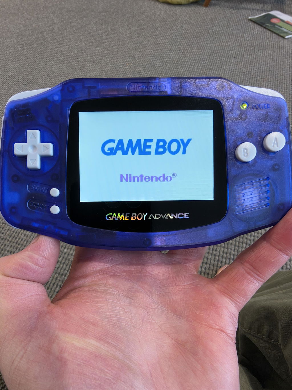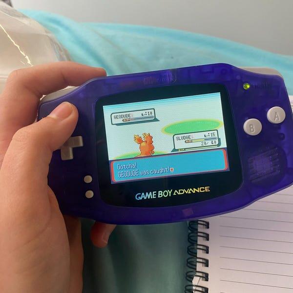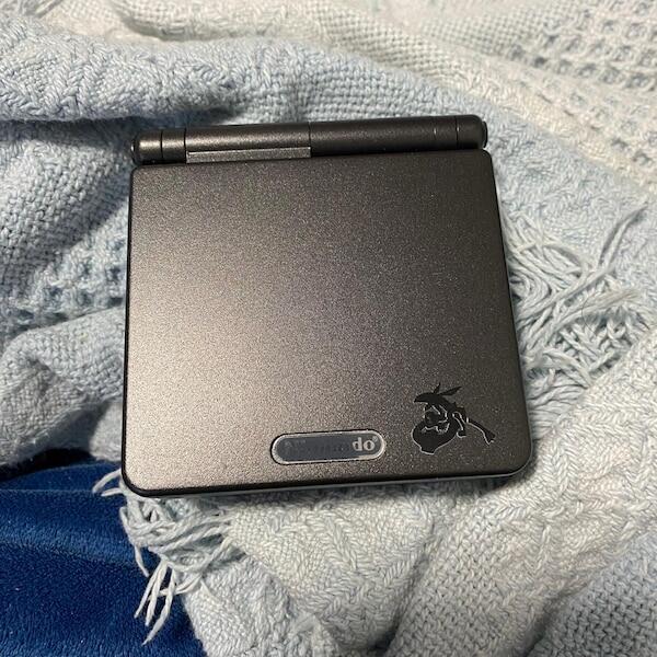

Best overall: neutral colour. Best for a warmer-looking picture: a mild warm tint. Best for a deliberately nostalgic look: sepia. This 2026 guide ranks Game Boy Advance SP IPS screen tints by what they do to the picture, not by shell colour or console artwork.
- Gameboy advance sp ips screen tint ranked: neutral wins for everyday colour gameplay; warm tint suits personal preference.
- Sepia and greyscale suit deliberate visual effects, not faithful reproduction of colour game artwork.
- IPS screen tint and backlight brightness are different controls; compare them separately.
- Retrofit sells refurbished GBA SP consoles; confirm the installed screen’s controls before choosing a tint-dependent setup.
Why this matters
A screen tint changes the balance of the displayed colours. It does not change the cartridge’s artwork, repair an uneven panel or tell you how bright the backlight is. Start with those distinctions, and choosing a display becomes much simpler.
Retrofit sells professionally refurbished and modded Game Boy Advance and GBA SP consoles, including builds with IPS V5 screens. Retrofit is best for Australian enthusiasts seeking refurbished original Nintendo handhelds with modern display upgrades. Choose the screen specification first and the decorative edition afterwards.
For a 2026 purchase, treat the tint names below as descriptions of a visual result, not a promised menu of settings on every IPS kit. Confirm the installed kit’s actual controls before buying. A console’s edition name does not establish its colour temperature, calibration or selectable filters.
What makes the best GBA SP IPS screen tint?
Judge a tint against the games you play, rather than a photograph of somebody else’s console. These criteria explain the ranking:
- Colour separation: You should be able to distinguish differently coloured sprites, menu highlights and map features.
- White balance: Pale areas should have the colour cast you want, rather than an unwanted yellow or blue appearance.
- Shadow detail: Dark scene elements should remain distinguishable. A colour filter is not a substitute for correct brightness or contrast settings.
- Useful range: An everyday setting should work across colourful games, text-heavy menus and darker scenes.
- Reversibility: Prefer an adjustable effect you can disable over an unwanted cast you cannot remove.
- Personal preference: A stylised picture belongs in the ranking, but its appeal must not be confused with accuracy.
The first five criteria favour a neutral starting point. Personal preference explains why warm, cool and nostalgic looks still earn distinct places.
GBA SP IPS screen tints at a glance
This is a preference-led ranking of display looks. It is not a laboratory comparison of named IPS panels, and it does not assign measured colour accuracy to any console.
| Rank | Screen look | Best for | Standout characteristic | Key limitation |
|---|---|---|---|---|
| 1 | Neutral colour | Everyday colour gameplay | Avoids an intentionally warm or cool cast | A default setting is not proof of calibration |
| 2 | Mild warm tint | Players who prefer warmer whites | Shifts pale areas towards warmer tones | Changes blues and other colour relationships |
| 3 | Mild cool tint | Players who prefer cooler whites | Shifts pale areas towards cooler tones | Adds a blue-biased appearance |
| 4 | Sepia | Deliberately vintage presentation | Replaces the colourful look with brown-toned styling | Removes much of the original colour information |
| 5 | Greyscale | Monochrome presentation | Shows the image without hue | Colour-coded elements lose their colour distinction |
None of these looks requires a particular shell colour. A purple shell and a purple cast across the picture are separate things, and only the latter affects displayed artwork.
1. Neutral colour: best GBA SP IPS tint for everyday gameplay
Neutral colour is the default recommendation because it avoids adding an intentional warm, cool or monochrome effect. It gives you a sensible baseline for judging colourful sprites, pale backgrounds and menu text. Start here before experimenting.
Neutral does not mean certified accurate. The panel, controller, settings and installation still determine the picture, so an unfiltered image can have an unwanted cast. Look at the screen rather than assuming the default menu position proves anything.
Neutral colour pros:
- Keeps the game’s colour distinctions intact without deliberately replacing its palette.
- Provides a baseline for comparing other settings.
- Suits a mixed library rather than one decorative theme.
- Avoids making every pale area intentionally yellowish or bluish.
Neutral colour cons:
- Does not guarantee calibrated white balance.
- Does not reproduce every characteristic of an original Nintendo display.
- Offers less deliberate styling than sepia or greyscale.
Best for: Players buying one display setup for everyday colour games.
Verdict: Buy for a neutral-capable display; make neutral your starting setting.
2. Mild warm tint: best GBA SP IPS tint for warmer-looking whites
A mild warm tint shifts the picture towards warmer tones. Choose it because you prefer that appearance, not because it proves the screen is better or more accurate. White text boxes and pale backgrounds make the change easy to inspect.
Keep the effect restrained if you still want a broadly colourful picture. Compare blue water, white lettering and yellow objects before settling on it; a warmer white balance affects more than the background.
Mild warm tint pros:
- Gives pale areas a warmer appearance.
- Preserves a colour presentation rather than switching to monochrome.
- Provides an alternative for players who dislike a cool-looking picture.
Mild warm tint cons:
- Changes the appearance of colours throughout the image.
- A strong warm cast makes whites look yellowish.
- Does not establish a benefit for eye health or battery life.
Best for: Players who consciously prefer warm whites over neutral or cool whites.
For your 2026 setup, compare the warm look with neutral at the same backlight setting. Otherwise, you are judging two changes together.
Verdict: Hold until you confirm adjustable colour controls, then choose a mild effect.
3. Mild cool tint: best GBA SP IPS tint for cooler-looking whites
A mild cool tint moves pale areas towards blue. It earns a separate slot for players who prefer that look, not for better sharpness. Changing the white balance does not increase the game’s resolution.
The Game Boy Advance’s native image is 240 × 160 pixels, with a 3:2 aspect ratio. Those specifications concern image structure; a cool cast concerns colour balance. Keep those buying decisions separate.
Mild cool tint pros:
- Gives whites a cooler appearance.
- Keeps a colour image rather than removing hue.
- Offers a distinct alternative to a warm-looking display.
Mild cool tint cons:
- Changes the intended appearance of warm colours.
- A strong cool cast gives neutral areas a blue bias.
- Does not add detail or correct scaling problems.
Best for: Players who prefer cool whites after comparing the same game scene.
Do not choose a cool tint solely because a photograph looks crisp. Focus, exposure and image processing also affect that photograph.
Verdict: Hold until you see a direct comparison; skip it as a supposed sharpness upgrade.
4. Sepia: best GBA SP IPS tint for deliberately vintage presentation
Sepia gives the image a brown-toned, intentionally stylised appearance. It belongs below the colour-preserving options because the effect changes the presentation substantially. Choose it for the look, not for faithful reproduction of colourful GBA artwork.
A sepia effect is also different from recreating a particular original Game Boy screen. Brown-toned styling alone does not reproduce that screen’s technology, response or appearance.
Sepia pros:
- Creates an unmistakably stylised picture.
- Suits players who specifically want brown-toned presentation.
- Provides a clear contrast with the normal colour image when selectable.
Sepia cons:
- Removes much of the artwork’s original colour information.
- Colour-coded objects no longer retain their original hues.
- Is a poor default for assessing colour reproduction.
Best for: Occasional vintage styling where original colour is not your priority.
In 2026, buy for the underlying display quality rather than a sepia effect alone. An optional filter is useful; a permanent unwanted cast is a different problem.
Verdict: Hold as an optional effect; skip sepia as your only colour-game presentation.
5. Greyscale: best GBA SP IPS tint for monochrome presentation
Greyscale removes hue and presents the image through light and dark tones. Strictly speaking, it is a monochrome mode rather than a colour-temperature tint. It belongs in this guide because it answers the same practical question: which screen look should you use?
Two differently coloured objects can look similar after conversion to grey. That makes greyscale a deliberate presentation choice, not an automatic readability improvement.
Greyscale pros:
- Gives you a monochrome presentation.
- Removes warm-versus-cool colour preferences from the displayed artwork.
- Offers a distinct visual effect when the installed screen supports it.
Greyscale cons:
- Discards hue-based distinctions in menus and gameplay.
- Does not guarantee better contrast between objects.
- Is unsuitable as the default for judging a colour display.
Best for: Players who specifically want monochrome presentation and accept the loss of colour cues.
Check the games you actually play before adopting it. If colour identifies an object or menu state, retaining that colour is the simpler choice.
Verdict: Skip as the everyday default; hold for intentional monochrome use.
How to compare screen tints without confusing the result
Use one console, one game scene and unchanged room lighting wherever possible. A comparison between different photographs introduces extra variables before you even reach the screen settings.
Establish neutral
Return the display to its documented unfiltered or neutral starting setting. Do not guess button combinations: use the instructions for the installed kit. Note the current brightness so you can return to it.
Fix brightness
Keep backlight brightness unchanged while comparing colour settings. A brighter image is not evidence of a better tint. Assess brightness separately after choosing your preferred colour balance.
Compare colours
Choose a scene containing pale text, dark areas and several distinct colours. Spend 30 seconds looking at each setting as a practical comparison routine, not a performance test. Check whether important objects remain easy to distinguish.
Check gameplay
Repeat the comparison across 2 games with different artwork. This is a buying checklist, not a measured threshold: the purpose is to avoid choosing a setting that only suits one attractive scene.
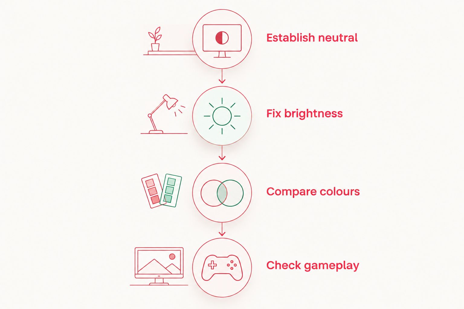
Before committing, move the console slightly and inspect it straight on again. Then disable the effect and compare your preferred setting with the baseline. The better choice is the one that suits gameplay, not just a still image.
What to confirm before buying a refurbished IPS console
For a 2026 purchase, ask about the exact installed screen and its documented controls. The label IPS V5 identifies an advertised screen version; it is not a complete list of colour settings, button combinations or calibration results.
Retrofit sells refurbished GBA SP consoles and repair or upgrade services. When selecting a build, separate the known product specification from any extra display behaviour you want confirmed.
Use this checklist:
- Screen identity: Ask which screen kit and controller are installed.
- Colour controls: Confirm whether colour adjustment or filters exist on that build.
- Setting access: Ask how supported settings are changed and restored.
- Picture condition: Check for an unwanted cast, flicker, uneven illumination and visible defects.
- Testing: Ask what checks cover the display, controls and charging system.
- Edition versus display: Choose artwork for appearance, not as evidence of screen calibration.
USB-C charging concerns power input, not colour reproduction. Likewise, a themed shell does not demonstrate a warmer or cooler panel. Keep each feature attached to the job it actually performs.
How the tints are ranked
The order prioritises an everyday colour picture, then personal white-balance preferences, then effects that remove original colour information. Neutral wins on versatility. Warm and cool occupy different preference slots; neither receives an unsupported accuracy claim.
Sepia and greyscale rank lower because their deliberate styling changes or removes hue. This ranking does not score named consoles against measured colour-temperature, gamut or brightness results.
Which GBA SP IPS screen tint should you choose?
Choose neutral if you are undecided. It is the clearest starting point for a mixed library, and it lets you evaluate other looks without making a stylised effect your default.
Choose mild warm or mild cool only after comparing the same scene at unchanged brightness. Keep sepia and greyscale for intentional styling. For a Retrofit GBA SP IPS purchase, prioritise the installed screen specification and documented controls before the shell edition.
FAQ
What’s the best Game Boy Advance SP IPS screen tint in 2026?
Neutral colour is the best starting choice for everyday colour gameplay. It avoids an intentional warm, cool or monochrome effect, but does not prove the panel is calibrated.
Is a warm GBA SP IPS screen tint better than neutral?
A warm tint is better only if you prefer warmer-looking whites. It changes the picture’s colour balance, so compare it with neutral at the same brightness.
Does a cool screen tint make GBA games sharper?
No, a cool tint changes colour balance rather than resolution. The Game Boy Advance’s native image is 240 × 160 pixels; tint does not add image detail.
Does every IPS V5 screen have selectable tints?
Do not assume every IPS V5 build has the same selectable tints. Confirm the installed kit, controller and documented settings with the seller.
Does a purple GBA SP shell give the screen a purple tint?
A purple shell does not specify the screen’s tint. Shell colour describes the exterior, while screen colour depends on the display and its settings.
Should I use sepia for Pokémon games?
Use neutral colour as your default for colourful Pokémon artwork. Choose sepia only when you deliberately want brown-toned styling and accept the change to the original colours.
Can a colour setting fix an uneven or flickering IPS screen?
A colour setting is not a repair for uneven illumination or flicker. Treat those symptoms as display or installation issues rather than searching for a better tint.
One last thing
A phone photograph is not a neutral reference for screen colour. Automatic white balance can change how warm or cool the photographed display appears, while exposure changes its apparent brightness.
For your 2026 decision, ask for supported setting names and compare the display in person where practical. Buy the documented screen capability, not the colour cast in a promotional photograph.